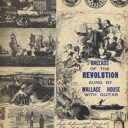
bible belters...


russian bible band from new york circa 1910. inscription added to the photo when printed...can you spot the sinner?
things related to sound, visual art, architecture, modernism, music, design, fluxus, 78's, literature, film, ephemera, and much more ...basically a space to share "the collection", much of which serves as inspiration for my work...
russian bible band from new york circa 1910. inscription added to the photo when printed...can you spot the sinner?


in oct. of 1965, vogue magazine ran an article on john cage called "a second fame: good food". it's a short article by ninette lyon about cage preparing her a lunch of gathered mushrooms, watercress, etc. and a lot of cage quotes about food and eating. here's one of cage's recipes (or perhaps it's a score for the performance of a salad making)...i don't think these were ever published beyond the article...
mushroom salad dressing:
juice of one lime or half lemon
2 tablespoons of mushroom "dogsup"
black pepper freshly ground
kosher salt
a pinch of cayenne
3/4 cup of heavy cream
this is served with a salad of peppergrass, watercress, chopped horseradish, leaves, catbrier, and bittercress.
photographer bruce davidson was sent out to cage's house in stony brook ny to take the photos during the lunch and gathering. a few years ago i found this proofsheet along with a larger one (which won't fit on my scanner), both dated august 1965, with davidson's stamp on the back. clearly from the same photo shoot as the article. i'm assuming the image from the arcticle was the one cut away with bits of red grease pencil in the upper left. i doubt these others have been seen since, so make yourself a salad and enjoy the views...

if you don't know who cage is or want to explore more, i'd suggest NOT surfing the web, but reading his first book of texts called "silence", his own words tend to be a lot more inspiring than history and others' perception of him.

everyone has probably heard the eric burdon and the animals version of house of the rising son... but i was driving home late tonight, feeling a bit down after giving a talk on my work. listening to some 78's in my ipod (yes... scratchy mono 78's in the ipod) in the car, and the josh white version of house of the rising son comes on and just slays me. first there is the giant amount of history on the surface of the shellac that makes the darkness fill with rain (the beauty of not collecting items in mint condition is you can actually HEAR the patina on the surface) and then his goddamn voice, it's just a hair away from being a croon, but fragile enough that it moves slowly inside of you. the thing about josh white is that he was so all over the place with his material. a lot of mediocre historical and topical wwII songs, silly songs like one meatball; and then he'll do a record like this, with strange fruit on one side (which rivals billie holliday in ethereal haunting-ness), and house of the rising son on the other side where he just sounds like he's lived it. i love the incredibly slow tempo, and his guitar playing ain't too shabby either. i think the recording is from 1944.
perhaps i like inconsistent artists because sometimes they fail, and it is this ability to fail - a kind of vulnerability - that makes the good stuff seem that much more honest. i swore if i ever started a blog it would simply be to share things from the collection, and would avoid the kind of sophmoric poetic waxings i've got going on here, but sometimes you gotta share the way gotta share... click and listen here.
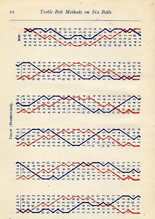
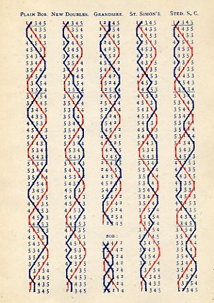
i looked for the book at used bookstores until i finally found a copy in 2002. a beautiful battered 1944 edition of "standard methods in the art of change ringing" and in bold letters beneath the title: DIAGRAMS, the scores were written by jasper snowdon in the 1880's. the book contains only diagrams, no explanations, which makes it that much more of a world to simply wander through. it also sparked a film/sound work called light forms.

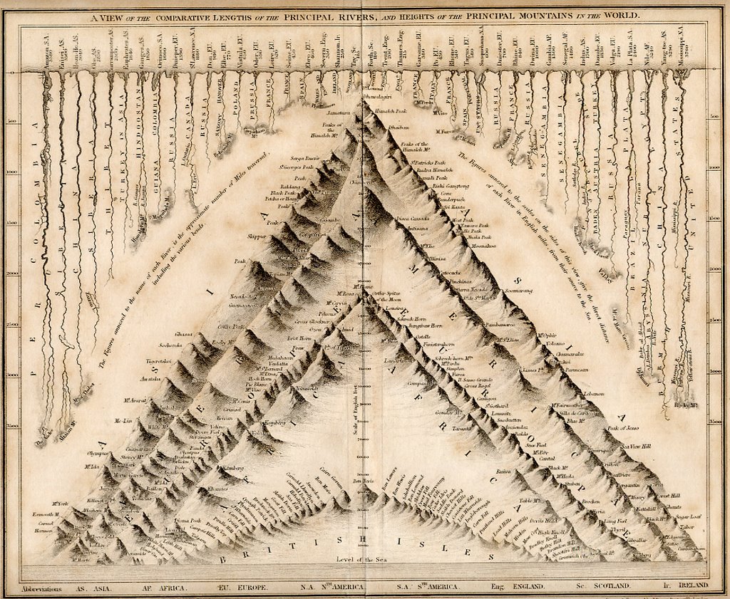
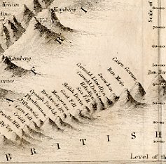
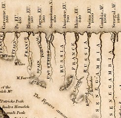
this is probably the oldest thing in the collection - an 1837 map titled "a view of the comparative lengths of the principal rivers and heights of the principal mountains of the world", published by john dower and william s. orr, who were highly respected mapmakers, printsellers, and publishers in early 19th century london. the beauty here is in the logic and the representation of it - flat images of rivers from a top view (looking like roots burrowing beneath an earthlike horizon line) whose lengths are compared to more rendered dimensional mountain forms(every mountain in the world stacked together); suggesting such profoundities as the length of the nile being equal to the height of the himaleh mountains. it's full of amazing detail, but also contains "some fascinating errors. dhaulagiri was considered the world’s greatest mountains (everest had yet to be measured) and the amazon the world’s longest rivers (the nile had yet to be mapped)". of course it also reminds me of alfred jensen...(click on the image of the whole map to see it big...)
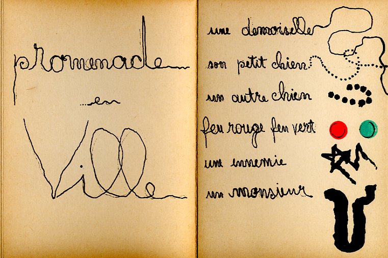
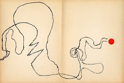
i got a few requests for more of warja honneger lavater's work. here's a few images from the other small book of hers i have. this one called "la promenade en ville". published in 1962 in zurich. this one tells the graphic map of a story of a woman, a small cat, another cat, a man, and i believe the "feu rough feu vert" is red light green light... for more on warja and her books see my previous post - picture stories.

under cover, everything is shifting and moving, yet nothing moves; nothing gives itself to the great wind that does not exist, yet everything is abandoning itself, everything is moving slowly, everything is proceeding towards some center of attraction, with all the torpid slow motion of a sleepwanderer."
camara laye "the radiance of the king" 1954
(i have been a quote gatherer for a very long time, thus these things too will enter as found...)
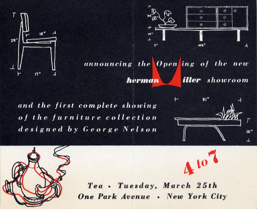
figured it was time to add george nelson and the herman miller company to the mix. for the last 15 years or so i've been collecting ephemera related to modern design / architecture - brochures, catalogs, advertising cards, hang tags, etc. this card is one of my favorites because it is connected to a seminal moment in modern furniture history. it announces the opening of the new herman miller showroom in nyc, and the first complete showing of a furniture collection designed by george nelson. just think, tuesday march 25, 1947 (a year before the 1948 herman miller catalog!) you could have had afternoon tea surrounded by the beginnings of what folks are fond of calling "mid century modern".
irving harper was responsible for most of the nelson office's graphic work, and it would appear that this was designed by him. perhaps because his print work was mainly for one company he's not often mentioned along with alvin lustig, paul rand, lester beall, etc. but his magazine ads for miller were consistently stellar, and most people credit him with the designs on most of the great george nelson clocks. i'll be posting a lot more of this stuff in the future.

forget the ides of march - beware the children of preachers bearing musical instruments! ...seeing as i posted the devil to the blog a few days ago, and seeing that it's sunday, i figure i should balance the evil mojo with some good ol' hallelujahs... dig out the earplugs because gospel car is coming to a town near you... (and speaking of the bugaloos, click here and check out some real insanity)
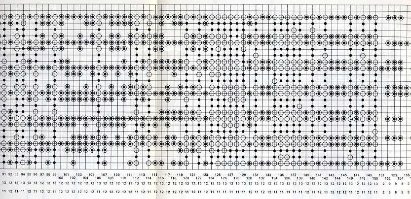
in 1971, peter struycken exhibited his "image and sound programme 1" as part of an exhibition of visual and sound explorations in amsterdam. struycken's piece was influenced by his interest in the meeting of patterns and chance - a perfect thing to explore with early computer generative compositions ( in this case, images made up of filling in and erasing various squares in a large grid pattern; and sound made up from a similar set of decisions and permutations of sine waves).

the catalog is not big on technical explanations, but both the sound and visual structures are based on 24 different patterns, each with a fixed number of points - 8 with 16 points and 16 with 8 points. no pictures of the installation, but nice images of scores, code etc. and a great statement from the artist. here are some fragments...
"variation in its wildest sense, that is in every conceivable field and resulting in every type of experience, is for me a necessity of existence... if chance is one extreme of the possible ways of organizing a structure and repetition is the other, there is a vast field of possibilities in between which can either be regarded as the extension of repetition towards chance, or as the restriction of chance towards repetition...if structures are to be made which are not entirely regular or not entirely random, and if a large number of variants with particular common characteristics is required, rules must be made to restrict chance or prevent repetition..."
fortunately the catalog also has a 7" flexi documenting "image and sound programme 1" with recordings of structures no. 1 - 180. i have to say i think it's an absolutely beautiful piece of minimal electronic music, and quite amazing to think that it's over 35 years old. it would be right at home on raster noton or line.
you can hear the entire 12 minute work HERE.

struycken was born in 1939, and is largely known as a designer and early proponent of computer design and artwork; including some massive light and color installations. he's also designed textiles, flooring surfaces, and even a postage stamp! some great texts related to his computer work of the 70's here

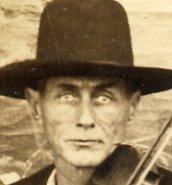
well, i paid too much for this card because the goddamn dude in the background looks like the devil. perhaps it's him, perhaps it's not; but the whole situation reminds me of that twilight zone where the guy has to keep the door closed with the devil locked inside and curiosity eventually leads him to open the door and the devil escapes. there is some seriously scary mojo coming out of this guy - check out his eyebrows, eyes and ears! i might have to keep this locked in a lead box... regardless, a great guitar image.
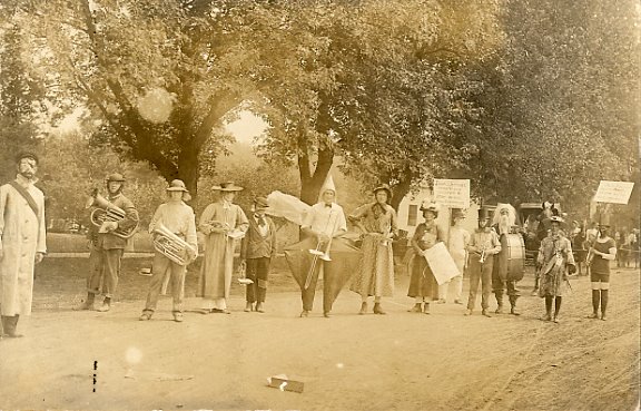
as i was gone for a week, a lot of new cards waiting for me at the po box today. no idea what these guys are dressed up for and unfortunately i can't read the signs, but oh man, check out the pants!


recently got this rppc of a band on a break at a carnival. check out the sideshow banners behind them. eva may mind reader clarvoyant hypnotist "reads your mind from the stage like an open book" and performs magnetic levitation! she must've also been quite a wordsmith as transeperellusion doesn't seem to be a word..
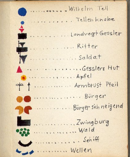
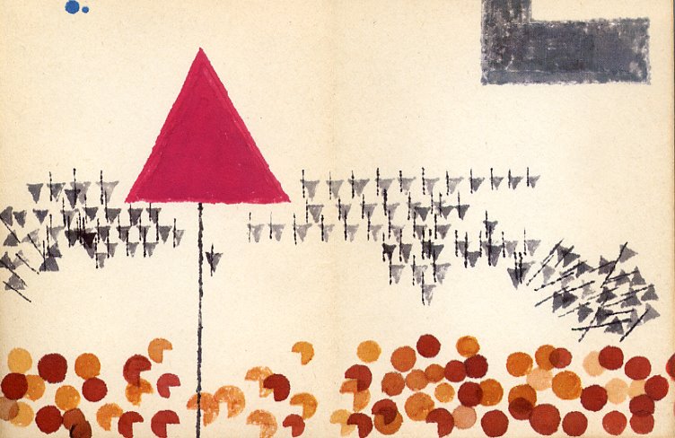
warja honegger lavater was born in switzerland in 1913. she worked in design before moving to new york in the early 60's. at that time, she created a number of accordion books that told stories through pictures. the first page usually has a "key" where abstract shapes are named as stand ins for people, places, things. it looks like she then painted one long huge panel, from right to left, telling the story by repeating shapes in a kind of narrative. i love the idea that somehow abstract drawing/painting could be created similar in process to telling a bedtime story.
the images here are from william tell, published in 1966. the single pages are only 3.5" x 4.75", the images below are two page spreads. the whole book opened flat is 4.75" x 76".


found drawings like this are a treasure and a treasure map all in one. there's the unintended pure beauty of the thing itself, and then the beauty of its manifestation and the wonder of its use. the drawing was found at the flea market on sunday; stuck inside one of our best recent flea market finds - funnies on parade from 1933, largely considered the first comic book (and worth a whole lot more than the two bucks we paid for it...). while it looks like an early mel bochner or a late emma kunz, it seems to be done by some todler who also wrote a list of boys and girls on the back - numbered to correspond to the striped colors on the front. i'm guessing the color choice system was used towards teasing the boys and girls about liking each other. the open square in the middle of the brown stripe for the 7 is quite wonderful.
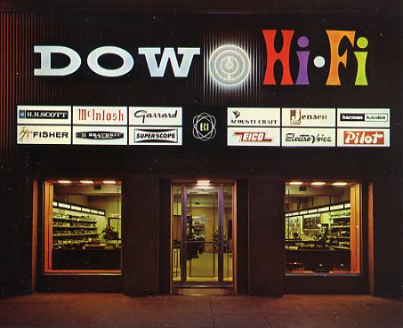
a few weeks ago i found this old postcard of the dow hi fi store in pasadena, probably taken in the mid 1960's. when i noticed the address on the back, i realized that it was not very far from our house, so i decided to take a look to see if anything from the storefront was still intact (obviously i knew the incredible signage was gone). when we arrived hi-fi quickly shifted down to low-fi. i couldn't believe that the super ugly on the outside and super useless on the inside electronics store, that i have had so many frustrating trips to, was once the "the west's most complete modern hi fi store". the drab windowless facade says it all...


nothing like finding two sound superheroes connected on one piece of paper. this is a great little undated brochure for the rental of films by madeline tourtelot, through cinema 16, probably early 60's as the address doesn't have a zipcode. the large one sided brochure advertises 5 of tourtelot's films including 3 of her short art films - "reflections" (with fascinating patterns of music composed by ed bland), "one by one" (a film-poem on the theme of fall), and "summer" (light humor and symbolic pantomime combine with well adapted music to produce a strikingly original film); and two related to sound/music/sculpture masters - harry bertoia and harry partch! the partch film, titled "music studio: harry partch" is included on the enclosure one from innova . it seems tourtelot collaborated with partch a number of times. the bertoia film is titled "metal dimensions", the description says "we see bertoia working in his studio, hear him talk, and study several of his works". it's 9 1/2 minutes i'd absolutely love to see! (anyone out there with a copy?!). unfortunately not a lot of info on tourtelot beyond the partch collaborations online, but i'm sure all of these films would be worth seeing if you are into maya deren and avant garde cinema. a lot more bertoia ephemera to come...
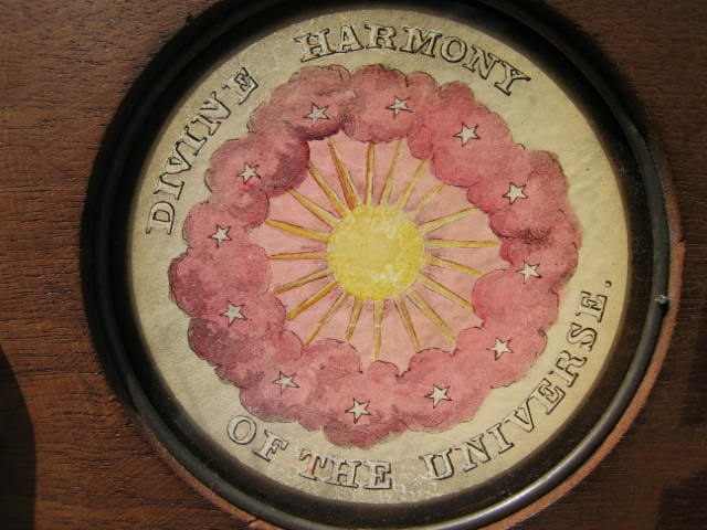
a turn of the century hand colored glass lantern slide. nothing like adding a little color to the blog and and a little more divine harmony to the web...
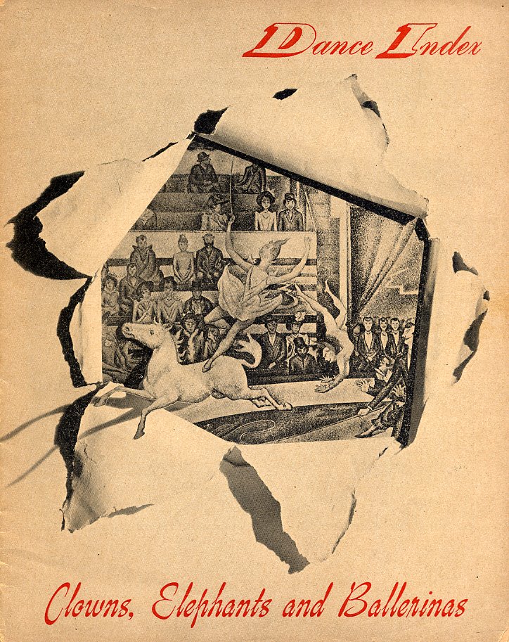
well, the last post got me thinking about joseph cornell (again!), so i dug out a very yellowed treasure - an issue of dance index he designed. it seems from the introduction that he contributed to a lot of issues; but i've no idea how many he did the complete design on. this issue, titled "clowns, elephants, and ballerinas", is from 1946.
in the introduction, lincoln kirstein says, "mr. cornell has a very special gift; the energy for collection, juxtaposition, and contrast. for him the inconsequential past is neither frivolous nor dead."
i'd like to think this blog might also contain such a gift (although at times it might also reluctantly embrace the inconsequential present...). cornell's work with dance index seems a kind of a precursor to a zine (which is perhaps a kind of a precursor to a blog) - he's not, as usual, taking his collection of images out of their respective cigar boxes in the basement and turning them into collages and objects - he's sharing them as they are; re-organizing them and creating connective tissue where he finds it. here's a few pages... as always click and see bigger.


in 2005, i was asked by the wire to write one of their inner sleeve articles - picking a record cover that has some sort of personal meaning beyond the music it holds. i chose "jury gagarin in space" because, since i found it, it's the only record cover that's consistently been on my bookshelf facing me while i work. the archives here seem like a good place to bring the text together with the cover and THE SOUND and the piece of mine that the 7" ended up having a huge role in. here's the article text...
"The impossibility of even beginning to pick a coveted sleeve was narrowed when I realized there are two records I look at almost every day - one of them is Jury Gagarin in Space. (the other will be part of an october post...)
When I stumbled upon it at a Paris flea market, Jury's face and the crudely drawn Earth (or is it the moon?) simply spoke to me - this wonderfully awkward eye candy of the front cover; and then the back...
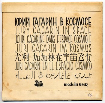
with JURY GAGARIN IN SPACE written in seven languages... I still can't believe that the word SPACE in English is equal to the evocative ESPACIO COSMICO in Spanish; nor that the black printing isn't really a dark shade of green. With so much to let my eyes wander over, the cover rested comfortably in my painting studio for years before I ever listened to the record inside.
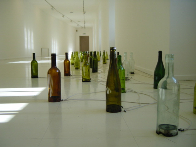
It seems like destiny that Joseph Cornell became the inspirational doorway for Jury Gagarin in Space to enter my work, as the cover looks like it could've been collaged together by Cornell himself. When a work of Cornell's inspired me to try to find a way to put the moon inside of a bottle; there was Jury looking down at me, suggesting I finally listen. The record ended up as source material for a sound piece running through 100 small speakers housed in 100 glass bottles called moonfield".

listen: jury gagarin in space