some seemingly incompatible loves...

eastman johnson, woman reading, 1874

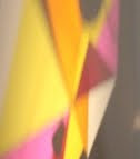
morgan russell, still life synchromy with nude in yellow, 1913
diego rivera, the hands of dr. moore, 1940

frantisek kupka, blue space, 1912

arthur dove, formation 1, 1943

arthur b davies, shy as a rabbit, 1900

milton avery, pool in the mountains,
last week i went down to san diego to give a talk related to my survey show, which is up at the sdsu art gallery. when i was just starting to make abstract paintings, circa 1984, i was pretty smitten with the work of howard hodgkin - particularly as his smaller works seemed humbler than a lot of the large scale painting going on at the time. the san diego art museum is currently exhibition a small show of paintings by hodgkin from the past 10 years, and since i'd totally lost interest in his work by 1986, i figured it might be worthwhile to drive to san diego a bit early, so i could spend some time with hodgkin's recent work... to see how relevant it might feel to me after stepping away from it for so many years.
while i will probably end up writing a post on hodgkin's work in the future, the best part of my day was wandering through the museum's permanent collection which i don't believe i'd seen in at least 10 years. as i wandered through the gallery, i ended up spending the most time with the 7 paintings pictured above... which left me wondering about their compatibility and their relationship not only to each other, but also in the type of images/objects i tend to respond to... especially since 3 are more or less abstract (2 non-objective), 3 are somewhat narrative (and relatively tightly rendered), and one - the milton avery - a landscape that hovers somewhere in between.
anyone who knows my work will not be surprised at the magnetic pull of the dove and the kupka. dove was the first abstract artist to really suggest to me the possibilities of making abstract paintings, and formation 1 is stellar - probably the best dove painting in southern california, and one of my favorites for how the shapes fit together and the feeling of motion. the first time i saw kupka's work in person was in lacma's seminal exhibition 'the spiritual in art: abstract painting' in 1986. the show changed my perception of what an abstract painting could be, and as an undergrad seeking alternatives to making artworks as academic discourse, kupka's cosmic interests seemed outsider-ish enough that they felt kind of rebellious (of course, it was sort of a quiet rebellion... like robert walser's writings or the recordings of moondog on a ny street corner).
i suppose if i am looking at degrees of abstraction, the next pair of images would be the russell and the avery. both have recognizable elements - something i tend to have less of an interest in - in relation to abstract painting; but russell's use of color reminded me of an off register comic book page, and the crude approach to color-as-science floored me. the painting reminded me of a pair of glasses i had as a kid that made all light look like rainbows. while clearly cubist-ically influenced, russell seems to be riffing off cezanne more than picasso, the color making still life quite woozy. russell's cosmic-ness is less grounded in kupka's spiritual quest, seeming more a product of conversing with goethe's color theories and the futurists sense of the culture of the machine and modernity, and from across the room russell's painting seems a mechanical mishap...
like most of avery's paintings, i am always floored by his ability to use flatness, soft fuzzy images, and his unbelievable use of color. everyone talks about matisse's use of color, yet folks rarely mention avery's. like matisse, avery was so great at integrating flat and dimensional images into a single composition... and both were able to make works with a feeling of lightness that never seems "thin." while the imagery in this landscape is not one of avery's most inventive, the sequence of yellow, blue, green, gray kills me. since i mentioned walser already, i might as well say that this landscape of avery's also reminds me of the kind of landscape some of walser's stories might take place... particularly the beginning of "the walk". like walser's shorter pieces, avery's paintings are deceptive... looking relatively simple on the outside, but feeling utterly complex once you are immersed.
the two most "realistic" paintings in terms of imagery, seem disconnected from the everyday - at least as i know it. 26 years separate eastman johnson's woman reading (1874) and arthur b. davies' shy as a rabbit (1900) - and the distance between the subjects and the rendering of the subjects in each painting are revealing. johnson's highly refined image of a woman reading a book with a sailboat in the background is no less stylized than davies' crude nude and rabbit - but between the two there is certainly a tension between the refined and the funky.
i've always been partial to the kind of quiet emotion of a painting like johnson's - he might not paint like vermeer or freidrich, but he does manage to capture an "inscape" through the picturing of an "outscape." i don't believe i've ever seen an american painting looking so dutch, and i think what i respond to more than anything else is the feeling of narrative (something i generally never look for in a painting), suggesting an atmosphere reflective of jacobsen's niels lhyne or the earlier romantic scenes of jack london's martin eden. perhaps it is the relationship of johnson's imagery to the mood of certain literature i respond to, rather than its relationship to painting that draws me towards it.
davies' painting is closer to a folk artist or a sunday painter. the woman is stiff, awkwardly pasted upon the surface. the rabbit looks flat and fake, and the landscape is as clumsy as it is beautiful. i think i responded so strongly to this painting because it was surrounded by works fueled by studied technique, and in such a context davies' painting stuck out like a sore thumb... and thus, it felt a bit more "real"... and a bit more as if it were wrought from necessity. it feels like a bedtime story, a folk song, a passion play.
the strangest painting in the museum is most certainly by diego rivera - a "portrait" called "the hands of dr. moore" from 1940. it's one of the more surrealist paintings i have seen by rivera. its tree on a small island can also be read as veins and tendons, feeling like a cruder salvador dali. this small painting floored me with its combined ability to attract and repel. images in paintings from the 1940's are rarely as difficult to look at or reconcile, but rivera's mix of humility, crudeness, pain, surgery, tending, trees, blood, cosmos, etc. is quite stunning from both across the room and just inches away. avery and davies' paintings seem strange because of their embrace of a kind of crudeness - seeming at first glances unrefined and awkward; but rivera's painting is unsettling in a totally different way. it is one of those things you don't really want to look at but can't help but stare at it in total fascination.
Labels: arthur b. davies, arthur dove, dan diego museum of art, diego rivera, eastman johnson, kupka, milton avery, morgan russell
3 Comments:
such a delight reading the way you talk about art, so much i learn from the "down to earth" way you approch talking about it, thank you for this!
like you the sequence of yellow, blue, green, gray of milton avery kills me, i love his his landscapes so very much
very few artists can talk about the joy, their process, and their "eye" in such an elevated and simplistic manner.
always so great to read your writing steve...
thanks so much for the kind words. much appreciated.
Post a Comment
<< Home